Remember that color blind test they made you take in middle school to see if you could see whatever letter or number the colored circles formed? That test checked if your eyes could use hue to make something legible. That’s just one of the ways visual impairments can affect your ability to read something. For website content, you want to make sure your content can be understood by everyone looking at it. That means considering the color, size, and contrast of the text and the backgrounds it appears over.
Why Is Contrast Important for Text?
Having sufficient contrast between text and the background is important for users with moderate visual impairments to read and understand web content. There are various types of visual impairments that can lead to someone not being able to distinguish between colors that are similar in contrast or hue without the use of assistive technology.
Color Contrast Exceptions
Before we get into the requirements, it’s important to note that there are exceptions. If the text that appears on the page is meant to be random or serves no purpose to the meaning of the rest of the page, then it doesn’t have to be accessible for the page to be compliant.
Text that appears in an image needs to be considered on a case-by-case basis. Incidental text that appears in photographs like street signs doesn’t have to be compliant. But text that is meant to be understood as text in an image is. For example, if you take a photo and then add text to the photo, that text needs to have sufficient contrast.
What Are the Contrast Requirements for Text?
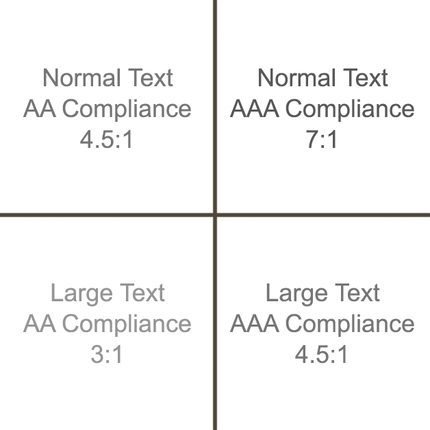
Depending on the context of the text and what level of compliance you want to achieve, there are different ratio goals that need to be met for it to be considered accessibility compliant:
- For normal text that has a font size equal or less than 16px
- AA compliance: 4.5:1
- AAA compliance: 7:1
- For larger text that has a font size greater than 16px
- AA compliance: 3:1
- AAA compliance: 4.5:1
Color Contrast Accessibility Remediation
To determine the contrast between text and background colors, use a tool like WebAIM’s color contrast checker, which lets you adjust the colors before you reapply them to your website. It’ll also let you know what level of compliance the color contrast is passing.
If you’re still having issues identifying accessibility issues or remediating them, then you should reach out to DiscoverTec. We’ll start with a free web accessibility consultation on how to get your website accessibility compliant.